Client:
Project:


Project:
Client:

{↑}{→} Limited edition slipcase and book. The foil detailing is engineered to read as a subtle deboss under normal light, but under UV illumination reveals concealed text and hidden messages, adding a layer of discovery to the object.
{↓} Five distinct Colorplan covers, each digitally printed in full colour with Digi-White, and finished with a UV-reactive foil.


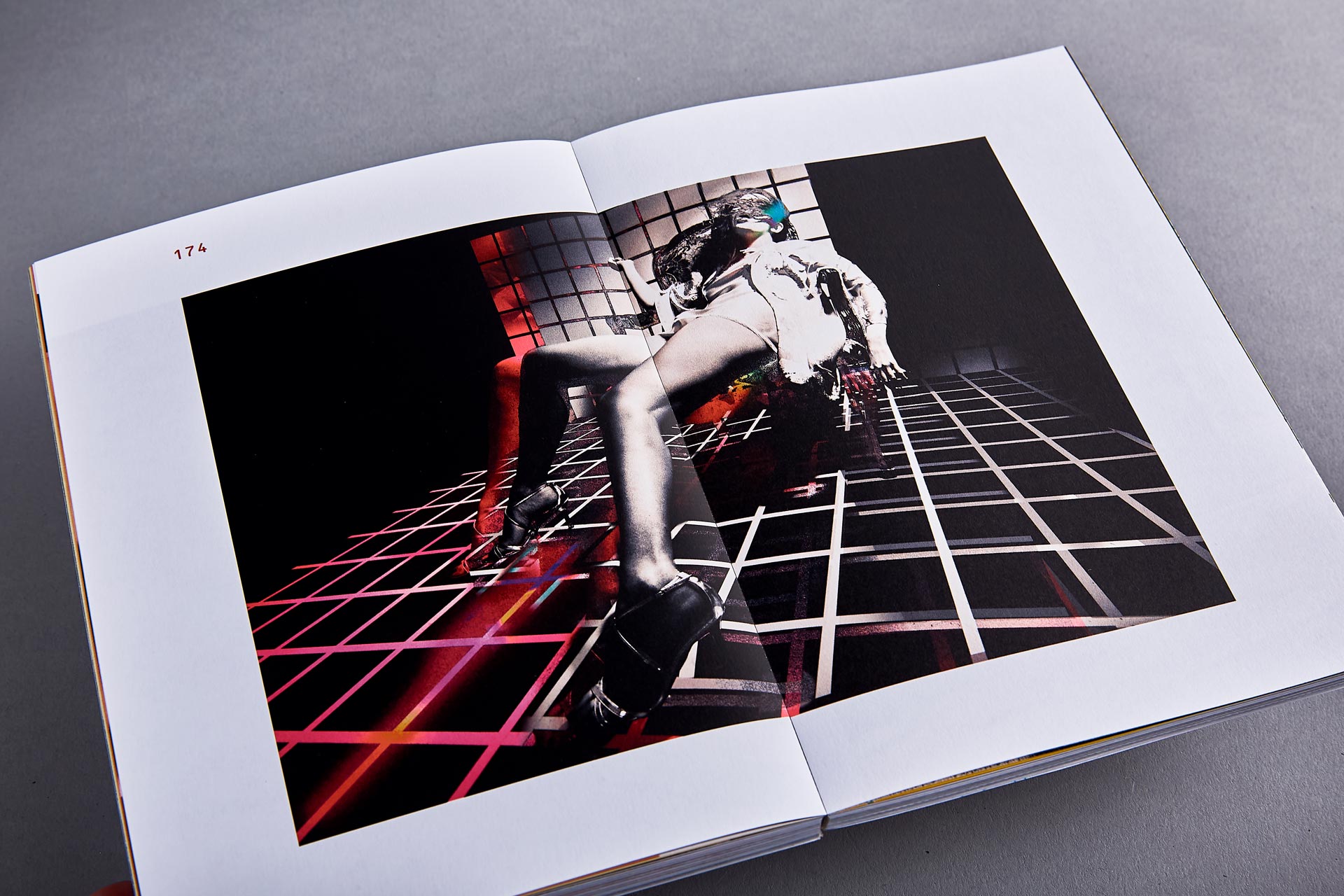
{↑} The book is OTA bound, allowing it to open and lie significantly flatter than a traditional perfect-bound edition. This ensures imagery and typography can run uninterrupted across spreads, maintaining clarity and continuity throughout.
{←}{↓} The full limited edition package includes a book with a special edition Cool Grey Colorplan cover finished with UV-reactive foil, four A5 cards, all housed within a custom slipcase also treated with UV-reactive foil, and packaged in a bespoke kraft mailer.


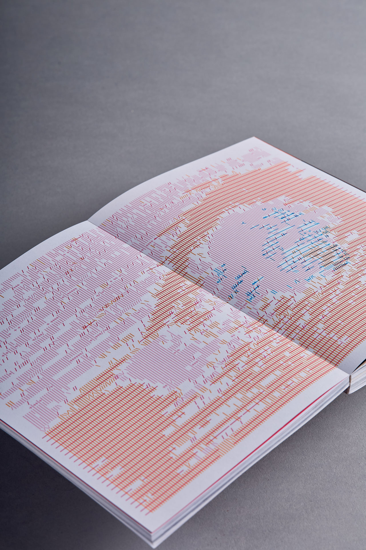
{↑} OCR-B by Adrian Frutiger is used throughout the book. Its monospaced structure enables a designed language we refer to as 0RGAN/SED CH405. Working strictly within the character set of the typeface, we constructed a series of interference patterns that sit in dialogue with both the written content and the photography. This approach extends into a wider typographic system for the book, where language is deliberately destabilised and re-coded: R/†UAL TECHN()LOGY, TH/S /S AN []BJECT OF CULTURAL S/GN/F/CANCE, C[]NFUS3 TH3 @LG()R1THM.
{→}{↓} Intro page to the book, featuring a foreword by Eugene Rabkin. The layout explores unusual colour pairings and extreme layering. Embedded throughout are a series of visual “easter eggs”, including fragmented film dialogue references and cryptic slogans supplied by Tim, adding a secondary narrative layer beneath the surface structure.

{↑} Tim & Michael (creative director at Studio.Build) edited the imagery down from hundreds of archival shots, distilling the selection into a tightly considered sequence. The book is structured into four sections, each defined by a core process colour: Cyan, Magenta, Yellow and Black.
Each section is introduced through a cryptic colour breaker, extending the system beyond a simple divider into its own coded layer. These interruptions add depth and ambiguity to the reading experience, encouraging the viewer to decode and uncover meaning gradually rather than consume it all at once.
{←}{↓} Images and graphic treatments together.
{↓} Vivid photography drawn from Tim’s extensive archive spans commercial portraiture, experimental image-warping collaborations, and moments of personal work, interwoven into a single sequence. Together, they form a printed articulation of the photographer’s internal world—fragmented, associative, and continually shifting.


{↑} Magenta section breaker, developed as a typo-image construct where language and image collapse into a single visual system. The piece operates as both divider and disruption, creating moments of interruption within the sequence, reinforcing the book’s wider logic of coded transitions and layered interpretation.
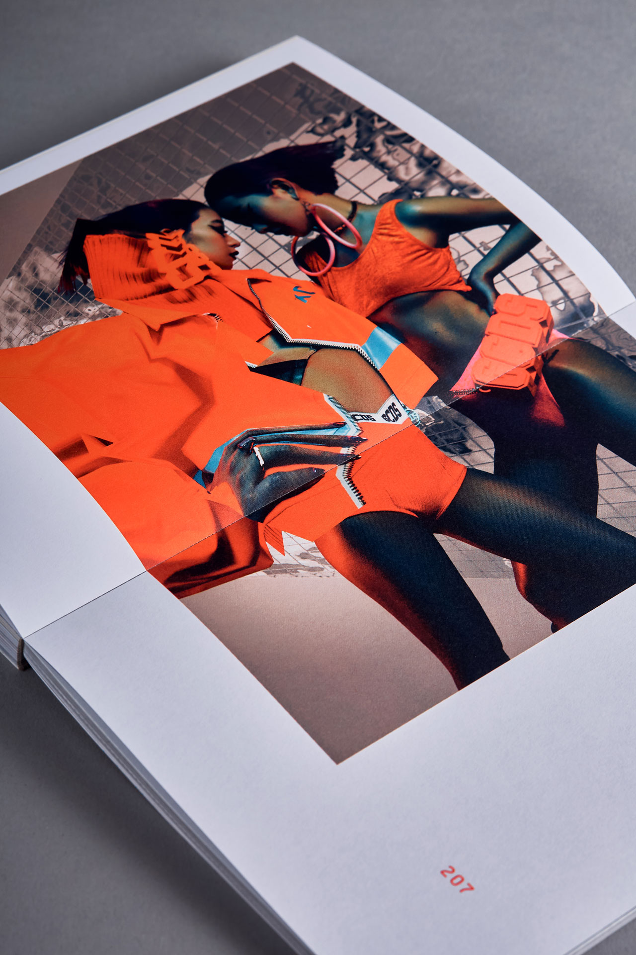
{→}{↓} The interiors of the book were digitally printed on a HP Indigo press, enabling a significantly expanded colour gamut and highly precise image reproduction. This capability allowed the photography to achieve exceptional vibrancy and tonal depth, in some instances approaching the intensity of spot fluorescent inks.
{↓} Ultra-graphic interventions interspersed throughtout gives the reader a surprise, adding contrast and pace to the book.


{↑} Yellow section breaker and typo-image construct.
{←}{↓} The book is OTA Bound, which means the book lays flatter than traditional perfect binding. This allowed us to play with imagery over the fold.
{↓} A selection of spreads also features Tim’s practice beyond still photography, highlighting his work as a director. Included are stills from the iconic Battles “Atlas” music video, reconfigured into a dynamic collage of frames that collectively capture the rhythm, intensity, and kinetic energy of the original piece. Rather than presenting single moments in isolation, the sequence builds a fragmented visual field that echoes the movement and structure of the film itself.


{↑} Black section breaker.
{→}{↓} Book spread showing typographic layering.
{↓} Tim’s trust in the process allowed us to fully experiment with the layout and treatment of his imagery throughout the book. This freedom led to a range of interpretive interventions, including dot and line screen translations, as well as layered typographic overlays. These manipulations shift the images between documentation and abstraction, extending their visual language while maintaining a direct connection to the source material.


{↑} Credits spread, Tim's work tends to be very colourful so we wanted to try and capture that in the colour palette throughout the book. Unusual colour combination, extreme layering and the inclusion of a number of visual 'easter eggs' in the form of film dialogue references as well as a series of cryptic slogans supplied by Tim.
{←}{↓} A5 cards (detail).
{↓} A5 art card set extending the book’s visual system into a series of standalone fragments. Each card isolates and reframes elements from the publication, echoing its use of layering, distortion, and coded typography.


